Data Explorer
Explorer page consist of 2 big sections: Controls & Results
Controls
Section titled “Controls”
Buttons
Section titled “Buttons”- Search: Initiates a query to retrieve data.
- Share URL: Copies the current selection and filters to the clipboard as a shareable URL.
- Download: Downloads the current selection in JSON format.
Limit Selector
Section titled “Limit Selector”Specifies how many rows of data should be retrieved from the server and displayed on page.
Time Range Selector
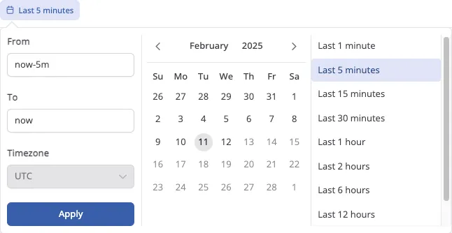
Section titled “Time Range Selector” Defines the time range for data retrieval, allowing either exact dates or a relative time period.
Query setup
Section titled “Query setup”The Query setup button opens a menu with settings related to query configuration. Currently, it allows you to enable or disable the raw query editor for the selected source.
Graph Setup
Section titled “Graph Setup”The Graph setup button opens a menu with settings for configuring graph visualization. Currently, it allows you to:
- Toggle graph visibility – Enable or disable the display of the graph.
- Set Group By column – Choose a column to group data in the graph.
Grouping is also supported for JSON, Map or Array column types using the colon (:) notation. (Refer to the Columns input documentation for more details on accessing nested data).
Columns Input
Section titled “Columns Input”A detailed description of the columns input is located on a separate page.
Query input
Section titled “Query input”A detailed description of the query input is located on a separate page.
Raw Query input
Section titled “Raw Query input”A detailed description of the raw query input is located on a separate page.
Saved views
Section titled “Saved views”![]() A detailed description of the
A detailed description of the saved views is located on a separate page.
Results
Section titled “Results”
Graph Representation
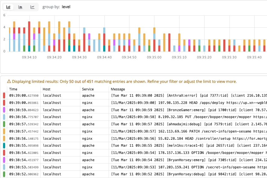
Section titled “Graph Representation”The graph is currently built based on the severity column, which is specified in the source and this is the only available behavior at the moment. In the future, there will be an option to build the graph based on any arbitrary key.
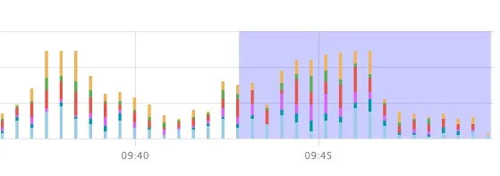
If the number of rows displayed on the screen does not match the range of the graph, the visible area of the retrieved and displayed rows is highlighted on the graph. This allows users to easily correlate the data in the table with its graphical representation, ensuring that they do not lose track of which rows have been loaded and displayed.
This visualization mechanism improves data navigation, especially when dealing with large log volumes where the full range of values may exceed the current viewable window. Example below.

Result Table
Section titled “Result Table”The resulting table always contains a time column, which is defined in the source. Row colors are determined based on the severity column from the source. This ensures that rows with the same severity have the same color. Also, row colors match graph colors.
Detailed View
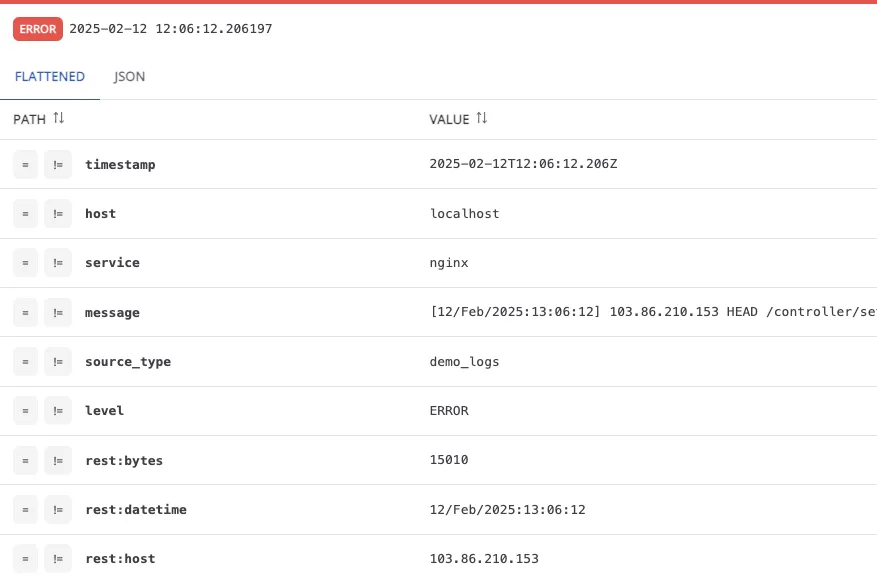
Section titled “Detailed View” Clicking on a row opens a detailed view in a modal window that takes up half of the screen. This detailed view displays all keys and values for the selected log entry. JSON paths are automatically flattened for easier readability (as seen in the screenshot). There is also an option to view the entry in raw JSON format.